No products in the basket.
Branded Workwear
Embroidery Artwork Requirements for Workwear
17
Sep
Sep
A logo that looks sharp on a website can become unclear, bulky or expensive when stitched onto a polo shirt or softshell. Getting the embroidery artwork requirements right before production protects your brand presentation, avoids avoidable delays and helps ensure every garment is fit for work.
For uniforms ordered across several departments, sites or job roles, consistency matters just as much as appearance. The approved logo on a receptionist’s cardigan should match the one on an engineer’s fleece, a care team tunic and a supervisor’s hi-vis vest. That starts with suitable artwork and clear instructions.
What artwork is needed for embroidery?
The best starting point is an original vector logo file, usually supplied as AI, EPS, PDF or SVG. Vector artwork is built from shapes rather than pixels, so it can be scaled without becoming blurred. It gives the embroidery team clean outlines, accurate lettering and a reliable reference for thread colours.
High-resolution PNG, TIFF or JPEG files can also be useful, particularly where vector artwork is not available. However, a small image copied from a website, social media profile or email signature is rarely suitable on its own. It may look acceptable on screen but often loses edge definition when enlarged for digitising.
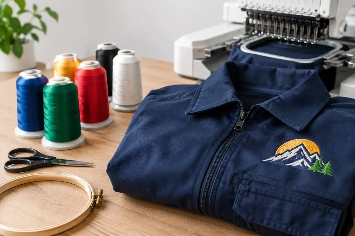
Digitising is the process of converting your logo into an embroidery stitch file. It is not simply a file conversion. The design has to be planned for fabric, stitch direction, thread coverage, lettering size and the position of each detail. A skilled digitiser may adjust parts of the design so that the embroidered result remains clear and durable.
Where possible, provide the original logo alongside any brand guidelines. This gives the production team the clearest reference and reduces the need to recreate elements from a low-quality image.
Embroidery artwork requirements that affect the result
Embroidery has physical limits that print does not. Thread has thickness, garments move, and some fabrics need a backing to support the stitches. A good embroidery design accounts for these practical points before the first garment goes on a machine.
Fine text and small details
Small lettering is the most common problem area. Text that is legible in a digital logo may be too fine to stitch cleanly, especially on the left chest of a polo, sweatshirt or fleece. As a working guide, lettering normally needs to be around 4-5 mm high to remain readable, although the exact limit depends on the typeface and fabric.
Fine lines, narrow gaps and intricate icons can also fill in during stitching. A logo with a detailed illustration may need simplifying for embroidery, while retaining the key elements people recognise. This is not a change to your brand without reason. It is an adjustment to make the brand mark work properly in thread.
If your organisation has a complex primary logo, it can be sensible to approve a simplified embroidered version for smaller placements. The full logo may still work well on back prints, banners and larger promotional items.
Colour references and thread matching
Supply Pantone references where they form part of your brand guidelines. These are useful for selecting the closest available embroidery thread. Exact colour matching is not always possible because thread has a sheen and sits differently on fabric than ink does on paper or a screen.
Thread colours should also be checked against the garment colour. A dark blue logo may disappear on a navy fleece, even if it is correct according to the original artwork. In that case, a white, light grey or approved contrasting version may be the better operational choice.
For teams wearing several garment colours, agree the logo treatment at the start. This prevents a mixed order of black, navy and royal garments from producing inconsistent or low-contrast branding.
Logo size and stitch count
A standard left-chest embroidery is often around 80-100 mm wide, but there is no single correct size. A short company name may need a wider layout, while a round badge may be better at a smaller diameter. The garment matters too. A large logo can look out of proportion on a ladies’ fitted polo or a small care tunic.
The amount of stitching in a logo is known as the stitch count. Dense designs use more thread and take longer to produce, which can affect cost. Large filled areas, detailed crests and multiple colour blocks generally have higher stitch counts than simple text or line logos.
This does not mean every logo needs to be stripped back. For a durable workwear badge or a premium front-of-house uniform, detailed embroidery may be the right option. It simply needs to be quoted and approved on the basis of the actual design rather than a rough assumption.
Choose a placement that suits the garment
Left chest embroidery remains the most popular choice for company workwear because it is visible, professional and suitable for most garment types. It works well on polos, T-shirts, sweatshirts, hoodies, fleeces, softshells, bodywarmers and jackets.
Other positions can be useful where the role or garment calls for them. Sleeve embroidery can identify departments or qualifications. Cap fronts suit compact logos. Back neck embroidery provides a subtle branded finish. Larger back branding is often better printed, particularly where the design includes a website address, extensive text or fine detail.
Placement must take garment construction into account. Pockets, seams, zip lines, reflective tape and waterproof membranes can restrict where embroidery can go. On hi-vis garments, branding must be positioned carefully so it does not compromise the reflective areas or garment certification. For protective and safety clothing, garment suitability should be checked before the order is confirmed.
Waterproof garments deserve particular care. Embroidery creates needle holes, which can affect water resistance. Depending on the garment and intended use, print or a heat-applied badge may be more suitable than direct embroidery. A softshell built for general site use may accept embroidery well; a fully waterproof shell used outdoors in sustained rain may not.
Provide a clear order brief
Good artwork is only one part of a production-ready order. The embroidery team also needs to know exactly where and how the logo will be used. This is particularly relevant for multi-garment orders, school leavers’ hoodies and staff uniform packs.
For a straightforward approval process, provide these details:
- The best available logo file and any brand guidelines.
- The garment styles, colours and sizes being ordered.
- Each embroidery position, such as left chest, sleeve or cap front.
- The required logo size, if you have one, or approval for a suitable standard size.
- Any names, job roles, departments or individual personalisation.
- Pantone references and approved alternative logo colours where relevant.
If the same logo is required across workwear, healthcare uniforms and event garments, say so at the outset. The embroidery can then be reviewed against each fabric and placement rather than treated as a one-size-fits-all application.
Approve the embroidery before bulk production
A visual embroidery proof is the point to check spelling, layout, thread colours, logo size and placement. Look at it as a wearer would, not just as a brand manager would. Can the business name be read from a sensible distance? Does the mark sit clearly on the selected garment colour? Is the logo proportionate to the garment?
For complex designs, new logos or larger orders, a physical sample can be worthwhile. It allows you to assess the actual thread finish and how the garment fabric supports the embroidery. This can add time before production, but it is usually preferable to correcting a full run after garments have been decorated.
Once artwork has been approved, keep the approved version on record. Repeat orders become quicker and more consistent when the same digitised file, placement and thread choices are used. If a logo is updated, treat it as new artwork rather than assuming the previous embroidery file will still be correct.
When print is the better choice
Embroidery is hard-wearing and well suited to professional uniforms, but it is not automatically the best decoration method. Print is often more effective for large graphics, photographic imagery, very fine text, gradients and designs with many small colour changes.
A practical approach is to use embroidery for a concise left-chest logo and print for a large back message or event graphic. This gives staff a durable everyday uniform identity without forcing detailed artwork into stitches that cannot reproduce it cleanly.
At Vivid Promotion, artwork is assessed against the garment, logo and intended working environment before decoration is agreed. That avoids the common mistake of choosing a method based only on appearance in a digital mock-up.
The right file is not necessarily the prettiest version of your logo on screen. It is the version that stays legible, recognisable and consistent after repeated wear, washing and issue across your team.