No products in the basket.
Branded Workwear
Can Logos Match Brand Colours on Workwear?
04
Nov
Nov
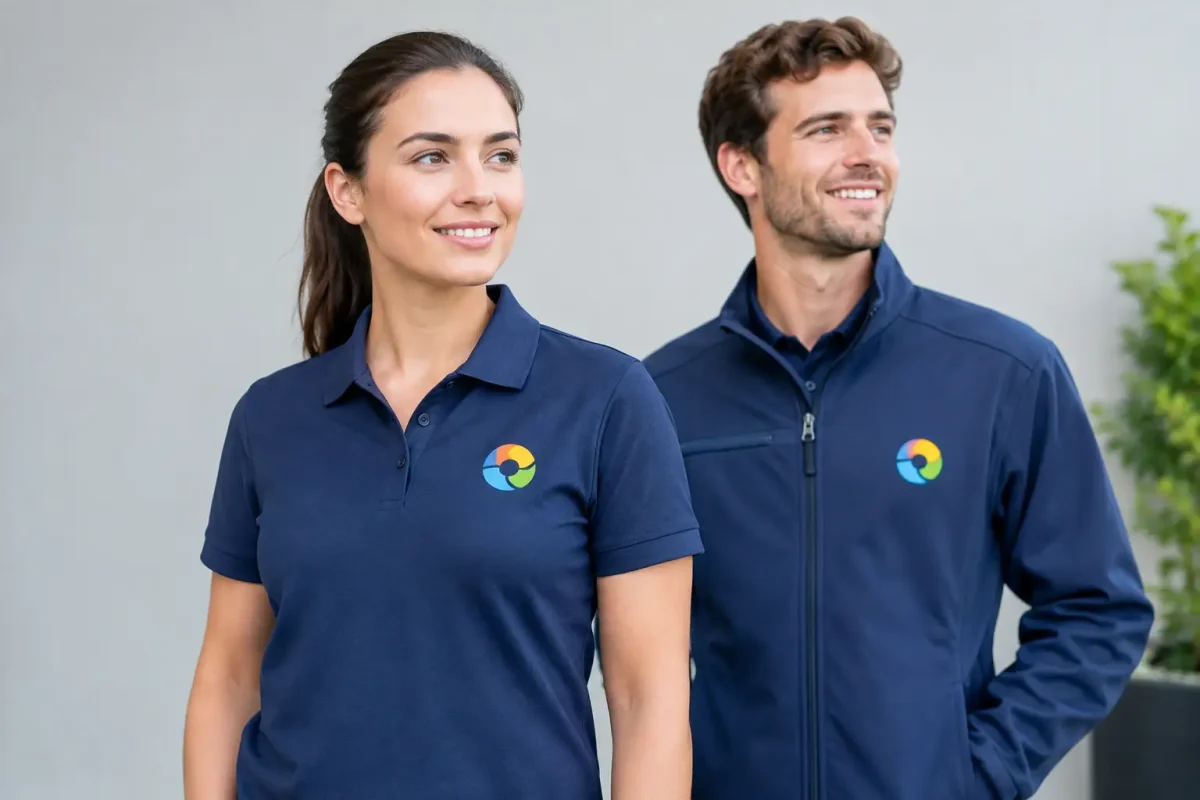
A logo may look exact on a white screen, but workwear is produced on fabric, using thread or ink, and often on several garment colours. So, can logos match brand colours? Usually, they can be matched very closely. But an exact match depends on the artwork supplied, the decoration method, the garment fabric and colour, and how the logo will be viewed in day-to-day use.
For uniforms, the practical aim is a clear, consistent logo that looks right across every wearer’s kit. That matters more than chasing a screen-perfect shade that is difficult to reproduce in thread, on textured fabric or across different garment ranges.
Can logos match brand colours across every garment?
Brand colours can be reproduced with a high degree of consistency, particularly when a recognised Pantone reference is available. Pantone gives a supplier a defined target rather than relying on descriptions such as ‘dark blue’, ‘bright green’ or ‘our usual red’. It is the best starting point for approving thread or print colours.
That said, the same colour will not always appear identical on every item. A printed logo on a smooth cotton T-shirt may look slightly different from an embroidered version on a textured fleece. Navy thread can appear deeper on a pale polo than it does on a black softshell. Light also changes perception – garments seen outdoors on site, under warehouse lighting or in a reception area will not look exactly the same.
This is normal production variation, not necessarily a quality issue. The key is to agree the closest suitable match and use the same specification for future orders. For teams ordering uniforms in stages, keeping approved artwork, thread references and print details on file helps maintain continuity.
Start with the right logo artwork
Colour matching begins before a garment is selected. A low-resolution image copied from a website or sent as a screenshot is unlikely to give reliable results. It can contain blurred edges, altered colours and too little detail for embroidery digitising or professional print production.
Vector artwork is usually the preferred format. Files such as AI, EPS, SVG or a press-ready PDF allow the logo to be resized without losing definition. A high-resolution PNG may be suitable for some printing requirements, but it is not always ideal for embroidery.
Where possible, provide the following with the logo:
- The original vector file or the best available high-resolution artwork
- Pantone references for each logo colour
- Any rules around minimum logo size, clear space or approved background colours
- Details of where the logo will be positioned on the garment
If the only artwork available is a JPEG, it may still be possible to redraw or convert it into a usable format. This should be done carefully, especially where the logo includes fine lines, gradients, small text or registered brand colours. A clean logo conversion is the foundation for accurate decoration.
RGB, CMYK and Pantone are not interchangeable
RGB colours are made for screens. CMYK is used in conventional print processes. Pantone is a spot-colour reference system. They are useful colour systems, but a value in one does not guarantee an identical result in another – and neither can precisely predict how a colour will look when sewn in thread.
For this reason, Pantone references are preferable for branded workwear. If a Pantone is not available, a physical sample, existing uniform or approved print can provide a more useful guide than a colour shown on a monitor.
Embroidery: durable and professional, with practical limits
Embroidery is a strong choice for polos, sweatshirts, fleeces, jackets, tunics, caps and many other workwear items. It is hard-wearing, has a professional finish and works especially well for simple logos with solid blocks of colour.
Thread ranges contain a large choice of shades, but they do not reproduce every possible Pantone colour exactly. Some brand colours will have a near match rather than a precise one. Metallics, fluorescent shades, very pale tones and complex gradients are particularly challenging in embroidery.
Logo size also affects how colours and details are handled. Fine lettering and narrow gaps can close up when stitched, particularly on a left chest logo. In some cases, small text needs to be enlarged, simplified or removed to keep it readable. This is not cutting corners – it is making sure the logo remains recognisable at the size it will actually be worn.
Fabric matters too. A heavyweight polo provides a stable base for stitching, while a thin garment or deeply textured fleece may need additional backing or adjustments to keep the embroidery flat. These production decisions help the logo look consistent and last through regular washing.
Print can offer closer colour reproduction
Printing is often the better option where a logo contains gradients, photographic elements, intricate detail or several closely controlled colours. Depending on the garment and artwork, modern print methods can reproduce a wider spectrum of shades than embroidery thread.
Printed logos are well suited to T-shirts, hoodies, event clothing, promotional garments and many uniform applications. They can also be preferable for large back prints, where embroidery may become heavy, costly or uncomfortable to wear.
However, print is not automatically the right answer. The garment must be compatible with the print process, and the intended use matters. For example, waterproof and water-resistant outerwear is normally better printed than embroidered. Embroidery creates needle holes that can affect the fabric’s protective performance, whereas an appropriate print can preserve the garment surface.
For high-use trade uniforms, the choice should balance colour accuracy with wash durability, placement and garment performance. A printed logo may offer the closest visual colour match, while an embroidered chest logo may be the more practical choice for a long-life fleece or polo.
The garment colour changes the result
A logo is never viewed in isolation. It sits against the garment, and that background affects its visibility and perceived shade. A dark blue logo that looks excellent on a white shirt may disappear on a navy jacket. A light grey logo may look understated on black, but lack sufficient contrast on a heather grey sweatshirt.
This is why a single logo treatment is not always suitable for every uniform item. Many organisations use a standard full-colour logo on light garments and an alternative white, light or simplified version on dark garments. It keeps branding readable without forcing a poor colour combination.
Hi-vis clothing needs particular care. The logo position must not interfere with reflective tape or reduce the visibility of required fluorescent areas. Where garments are selected for compliance, decoration should support the garment’s intended performance rather than compromise it. A clear logo placed correctly is more useful than a large design that affects visibility or certification requirements.
A practical approval process for consistent uniforms
The most reliable way to avoid colour surprises is to approve the job before production. For a first order, confirm the artwork, garment colour, logo position, decoration method and intended size. If colour is business-critical, request a visual proof and discuss whether a physical sample is appropriate.
For larger roll-outs, consistency should extend beyond the logo itself. A care provider may need the same department identity across tunics, scrubs, fleeces and outerwear. A construction firm may need branded polos, hoodies, hi-vis jackets and caps that look like one uniform programme rather than separate purchases. Using agreed logo variants and decoration specifications makes this manageable.
It is also worth planning for repeat orders. Staff join, sizes change, seasonal layers are added and replacement garments are needed. Keeping the approved setup means later orders can be produced to the same standard without repeatedly reviewing colours or artwork.
When an exact match is essential
Some brands have tightly controlled colours because they are part of a franchise, national campaign or established corporate identity. In these cases, state this at the quotation stage and provide the Pantone references. The supplier can then advise whether embroidery, print or a combination of both gives the closest result.
Be realistic about the material. An exact ink match on paper does not guarantee an exact thread match on a textured jacket. If a difference is unavoidable, a good supplier will explain it before production and recommend the option that protects logo recognition on the garment.
The best workwear branding is not judged under a colour-calibration lamp. It is judged when your team arrives on site, serves customers or represents your organisation at an event. Choose colours and decoration methods that stay clear, durable and consistent where the uniform is actually worn.