No products in the basket.
Branded Workwear
How to Prepare Artwork for Garment Printing
21
Sep
Sep
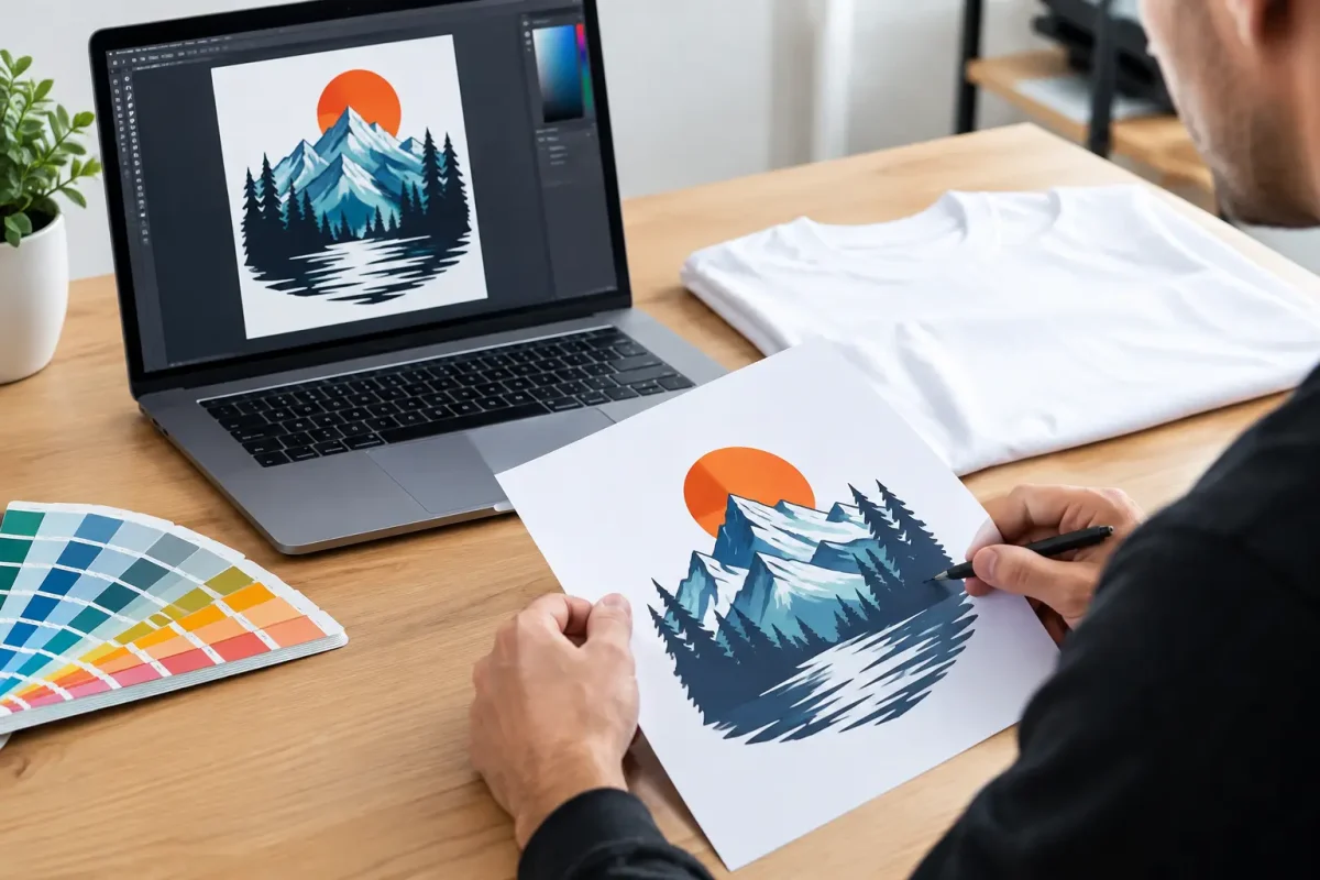
A logo can look sharp on a business card and still fail on a polo shirt. Fine lines fill in, pale colours disappear against the fabric, and a low-resolution image turns soft around the edges. To prepare artwork for garment printing properly, the design needs to suit both the print process and the garment it will be worn on.
For a small team order, a simple check before production can prevent delays and avoidable set-up costs. For uniforms across multiple sites, departments or job roles, it also protects consistency when the next order is placed months later. The aim is straightforward: provide clear artwork, confirm where it will sit, and choose a decoration method that will perform in real working conditions.
Start with the best version of your logo
The preferred artwork file is a vector format, usually AI, EPS, PDF or SVG. Vector artwork is built from mathematical lines and shapes rather than pixels, so it can be enlarged or reduced without losing definition. This matters when the same logo is needed as a small left-chest print on a polo, a larger back print on a hoodie, and a wide design across event T-shirts.
A high-resolution PNG may also be suitable for garment printing, particularly for a full-colour design, provided it is supplied at the intended print size and at 300 dpi. A transparent background is normally required. JPEG files can sometimes be used, but they are less reliable because they may have a coloured background or compression marks around the artwork.
Screenshots, photos of a logo, and images copied from social media are rarely suitable for production. They may look acceptable on a phone screen but are usually too small, compressed or blurred for a clean printed result. If this is all that is available, it may need to be redrawn or converted before approval. That is better dealt with before garments are booked into production.
Keep the artwork editable where possible
Editable source files make future changes much simpler. This is useful if a business later adds a phone number, changes a trading name, needs a different department title, or introduces a separate design for apprentices, visitors or events staff.
Text should be converted to outlines in final vector artwork, especially where a custom font has been used. Otherwise, the font can substitute when the file is opened elsewhere, changing spacing and sometimes the whole appearance of the logo. If the wording must remain editable, supply the font name alongside the artwork.
Specify garment placement and print size
A file alone does not tell a printer how the finished garment should look. State the required placement and approximate dimensions for every design. A left-chest logo, for example, is commonly around 80 to 100 mm wide, although a tall or detailed logo may need a different treatment. A centre-chest print, back print or sleeve print needs its own size instruction.
Think about who will wear the garment and how it will be used. A large rear print works well for a trades team on site or event crew working in a crowd, where identification from a distance matters. A smaller chest logo may be more appropriate for office-facing staff, hospitality teams or healthcare uniforms where a tidy, professional finish is the priority.
Avoid relying on a generic instruction such as “make it as big as possible”. Print areas vary between garments and sizes. A design that fits well on a medium T-shirt may need adjustment for a small ladies’ fit, a child’s leavers hoodie, or a high-visibility vest with reflective tape and mandatory clearance areas. A sensible size range and clear placement brief will give a more consistent result across the order.
Choose colours for fabric, not just for screens
Artwork colours should be checked against the garment colour. Navy lettering on a black softshell, for instance, may be technically correct but hard to read at a distance. The same applies to dark green on black, pale grey on sports grey, or yellow artwork on a hi-vis yellow garment.
Provide Pantone references when colour accuracy is critical, particularly for established brand identities. For printed workwear, the practical result can still vary slightly according to the print method, fabric composition and garment shade. A colour that appears bright on a backlit monitor will not always look identical on cotton, polyester or a textured fleece.
Where visibility matters, a high-contrast version of the logo is often the right answer. Many organisations keep a full-colour logo for white or light garments and a single-colour white version for dark outerwear. Supplying both versions at the outset avoids last-minute changes when different garment colours are added to the basket.
Prepare artwork for garment printing by method
The right artwork preparation depends partly on how the garment will be decorated. Print is not one single process, and the most suitable method depends on the design, quantity, fabric and expected use.
For screen printing, artwork is generally separated into individual spot colours. Each colour needs a clean, solid shape, and fine registration between colours can add complexity. Screen printing is a strong option for larger runs of T-shirts, sweatshirts and promotional garments where the design uses a limited number of colours and repeat consistency is needed.
For transfer printing, including digital transfers, full-colour artwork can usually be reproduced with more flexibility. This suits logos with gradients, photographs, shading or multiple colours, as well as smaller order quantities. Very fine detail still has limits, particularly on textured or stretch fabrics, so a production check remains worthwhile.
Direct-to-garment printing is best suited to certain cotton-rich garments and detailed artwork. It can achieve a soft, full-colour result, but fabric type, garment colour and order quantity all affect whether it is the right choice. A solid, simple logo on a large trade order may be better served by another method.
Embroidery should also be considered where durability and a raised finish are preferred. However, it is not suitable for every logo or garment. Small lettering, gradients and tiny detail may need simplifying for stitching. On waterproof jackets and certain technical outerwear, printing is often the better option because embroidery requires needle holes that can compromise the fabric’s water resistance.
Check line weight, text and fine detail
Small details are where otherwise good artwork causes problems. Hairline strokes may not reproduce cleanly, and tiny gaps can close up once ink is applied to fabric. As a general rule, keep lines and isolated details substantial enough to remain visible at the finished print size.
Text needs particular care. A slogan that is easy to read at 400 mm wide may be illegible when reduced for a chest position. If your logo includes a strapline, consider whether it is essential on every garment. Removing it from a small chest print while retaining it on a larger back print is often the more practical choice.
Reverse text, where lettering is knocked out of a coloured block, can also need extra space around the characters. The same is true of distressed effects, very thin borders and close colour changes. These features may look deliberate in digital artwork but become unclear after repeated washing and daily wear.
Account for garment material and workplace conditions
Cotton T-shirts, polyester polos, softshells, hi-vis vests and waterproof coats do not behave in the same way. Polyester can require specific inks or transfer processes to prevent dye migration. Stretch garments need decoration that moves with the fabric. Rough or heavily textured surfaces may limit the smallest detail that can be achieved.
For hi-vis workwear, branding must be positioned so it does not interfere with reflective bands or reduce the garment’s practical visibility. If a garment is required to meet a particular safety standard, the print position and coverage should be reviewed before ordering. A logo may be achievable, but not every location will be appropriate.
Also consider laundering, exposure and wear. A care agency uniform may be washed frequently at higher temperatures. Construction outerwear may be exposed to rain, abrasion and site dirt. Event merchandise may be worn only a few times but needs to look good immediately. Sharing this information helps ensure the print and garment are matched to the job.
Send a complete brief, not just a file
The quickest way to move an order into production is to provide the artwork alongside the practical details: garment style and colour, logo positions, print sizes, quantities by size, and any individual names or role identifiers. If different departments need different designs, label each version clearly rather than sending several similarly named files.
For larger uniform roll-outs, approve a visual proof before production begins. Check spelling, logo proportions, colours, position and whether the correct artwork has been assigned to each garment. This is especially useful for mixed orders containing polos, hoodies, hi-vis items and outerwear, where the same logo may need slight adjustments by product.
Vivid Promotion can help assess whether supplied artwork is suitable and flag issues before the garments are decorated. Early approval keeps production moving and gives your team a repeatable standard for future orders.
Good artwork preparation is not about making a file look technical. It is about making sure the finished uniform remains legible, durable and recognisable once it is being worn on site, on the road, in a classroom or in front of customers.