Branded Workwear
PVC Banner Printing that Holds Up on Site
Feb
A banner only gets one job: be seen. Yet most problems we hear about are completely avoidable – unreadable text at 10 metres, hems tearing at the first windy weekend, or a “black” logo that prints brown because the artwork wasn’t set up properly. If you’re ordering banners for a site, a depot, a school event or a trade stand, PVC Banner Printing is usually the most cost-effective way to get large-format branding that survives real use.
What PVC banner printing actually is (and why it’s still the default)
PVC banners are printed onto a flexible vinyl material. It’s tough, water-resistant, and forgiving when it comes to handling and installation – you can roll it, strap it, hang it, take it down, and put it back up without it falling apart after one outing.
For operational teams, the appeal is simple: you can cover a lot of area for sensible money, and you don’t need specialist frames to make it work. Mesh banners, fabric flags and rigid boards all have their place, but for general-purpose signage that needs to travel between jobs or events, PVC is the reliable workhorse.
Choosing the right banner material: 440gsm vs 510gsm vs mesh
Most PVC banner choices come down to weight and wind handling. The numbers (gsm) describe how heavy the material is per square metre. Heavier usually means tougher and less prone to creasing, but also slightly stiffer and more expensive.
440gsm is common for short-term and indoor use, or for banners that won’t be under constant tension. If it’s going up in a sports hall, a school corridor, or behind an exhibition table, 440gsm is often enough.
510gsm is the more durable option for repeat use and outdoor installations. If you’re tying it to heras fencing, hanging it on scaffolding, or fitting it to a building frontage where it’ll get wind and weather, 510gsm is the safer bet.
Mesh PVC is the exception worth knowing. It has tiny perforations that let wind pass through, reducing “sail” effect. If the banner will be in a very exposed position, mesh can prevent ripped hems and pulled eyelets. The trade-off is print vibrancy – colours can look slightly flatter because you’re printing onto a material with holes in it.
Finishing that stops banners failing: hems, eyelets, and reinforcement
Print quality matters, but banner failure is usually mechanical. The weak points are the edges and fixing points.
A hem is where the edge is folded and bonded to create strength. For banners that will be tensioned, hems are not a nice-to-have – they spread load across the edge so the banner doesn’t tear around the eyelets.
Eyelets are the metal rings that take the strain from bungees, cable ties or rope. The right spacing depends on size and exposure. A small indoor banner can cope with fewer fixing points. A large outdoor banner needs more frequent fixings so it doesn’t flap itself to death.
For repeated outdoor use, ask about reinforced edges. This adds extra strength (often a reinforcing strip within the hem) so the fixing line holds up longer. If you’re running banners as part of a recurring event calendar, reinforcement usually pays for itself in banners that last more than one season.
Size and layout: what actually reads from a distance
The biggest design mistake is treating a banner like a flyer. A banner is read at speed, from an angle, often through a fence, and sometimes in poor light.
Keep the message simple. In most cases, your banner needs three things: who you are, what you do, and how to contact you (or where to go next). If you try to add services, accreditations, social handles and paragraphs of copy, you’ll get none of it read.
Text size is where teams get caught out. As a practical rule, the main message needs to be big enough to read from the distance people will first see it. If it’s on roadside fencing, that distance is far greater than if it’s behind a reception desk.
Also consider “dead zones”. Eyelets, hems, and cable ties can obscure content, especially if the banner is pulled tight. Leave a safe margin around the edge so your logo and phone number aren’t sitting under a bungee knot.
Artwork setup: the checks that prevent expensive reprints
Most print problems are artwork problems. You don’t need to be a designer, but you do need to supply files that won’t fall apart when scaled up.
First, use vector artwork where possible (PDF, EPS, AI). Vectors scale cleanly for big banners. If all you have is a small JPEG from an email signature, it may look fine on a screen and still print soft and jagged at 3 metres wide.
Second, make sure colours are set sensibly. Screens display colour using light, print uses ink. Some bright on-screen colours simply can’t be matched exactly in print. If brand consistency matters across workwear, vans and signage, it’s worth using brand colour references and accepting that very specific tones can shift slightly depending on material and finish.
Third, check your image resolution. Large background photos can work well, but only if the original image is high quality. Stretching a low-res photo to banner size is the quickest route to a blurred, pixelated mess.
Finally, think about fonts. If you supply an editable file, fonts should be embedded or outlined so nothing substitutes at print time. The wrong font can change spacing and line breaks, and that can wreck a layout designed to fit a fixed size.
Where PVC banners work best (and where they don’t)
PVC banners suit repeatable, practical signage: site branding, event perimeters, sponsor backdrops, school open evenings, safety messaging, directional signs, and temporary promotions.
They’re less suitable where you need a perfectly flat, premium finish for close-up viewing – for example, high-end retail interiors where creasing would look untidy, or permanent external signage where a rigid panel would stay sharper for longer.
If you’re fitting banners to a very windy location, mesh can help, but there’s a point where a rigid sign, a tensioned frame system, or relocating the sign is the better decision. A banner that whips constantly will fail eventually, no matter how well it’s made.
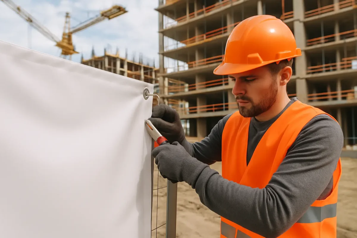
Installation realities: fixings, fences, and wind
How you install the banner matters as much as how it’s printed.
For heras fencing and temporary barriers, bungee ties are usually better than cable ties because they give slightly under gusts, reducing stress on eyelets and hems. Cable ties can work, but if you over-tighten them you create single stress points and the banner can tear.
Try to fix at multiple points across the top and bottom, not just the corners. Corners take the highest load, so spreading tension keeps everything calmer.
If the banner will be moved frequently between sites, consider how it will be handled. Rolling (not folding) helps prevent creases. Storing it dry reduces mould marks and staining. It’s basic, but it’s what keeps a “one month” banner usable for a year.
Single-sided vs double-sided printing
Most PVC banners are single-sided, because they’re typically viewed from one direction (fencing, walls, backdrops). Double-sided banners exist, but they’re heavier and more expensive, and they need a blockout layer so the graphics don’t show through.
If you genuinely need visibility from both sides – for example, a banner hung across a walkway – it may be better to use two single-sided banners back-to-back, depending on how it’s being mounted. You get stronger colour on each face and often better value.
Turnaround, quantities, and keeping things consistent across locations
Banners are often ordered under time pressure. The practical way to avoid rush reprints is to standardise sizes and layouts for repeat use. If you operate across multiple sites, a consistent banner spec also helps your team install them quickly – same eyelet pattern, same fixing method, same placement for contact details.
If you’re ordering for multiple branches or departments, consider producing a master banner design with variable sections (site address, phone number, department name). That keeps branding consistent while still making the banner useful locally.
This approach mirrors how many organisations handle uniforms: one brand standard, then role or site-specific details where needed. If you already manage logos for garments, the same artwork discipline carries over. If you want a broader view on getting logos right for stitching and print, this piece is a useful reference: Personalised workwear embroidery in the UK: what works.
A quick spec checklist before you place the order
Before you approve artwork, confirm what matters operationally: where it’s going, how long it needs to last, and how it’s being fixed. That’s what drives the right material and finishing.
At minimum, you should be clear on the banner size, whether it’s 440gsm, 510gsm or mesh, whether it needs hems and reinforced edges, and the eyelet spacing. Then check the artwork is suitable for scale and that key information sits inside a safe margin.
If you’re sourcing banners alongside branded workwear or event kit, it can be simpler to keep production under one roof so colours, logos and deadlines are managed in one place. Vivid Promotion supports workwear branding and related display items for UK organisations that want reliable lead times and a straightforward process.
The final test is basic: stand back and ask what a passer-by will understand in two seconds. If the answer is clear, the banner will do its job – and you won’t be reordering because the first one “looked fine on screen”.